First-Person: Project Management Lessons from the Field

As we grow in our profession, each project and experience offers something to learn. I have yet to encounter a project that didn’t contain at least one insight that could be carried forward and applied in the future. These lessons can range widely in scale from major life lessons, to understanding minimum space requirements that can impact a project’s bottom line during construction, to smaller takeaways such as realizing a question should have been asked earlier in the design process.

Each experience leaves an imprint that shapes the path forward. When those moments are acknowledged, studied, and carried with us, they deepen our perspective and enrich not only future projects, but the arc of our entire career.

Live and Learn

One of my earliest experiences was during a summer internship while I was still in school. I was tasked with preparing a graphic presentation for a client—back in the days when presentations had to be plotted and mounted on boards. I was using Photoshop for the first time and created a site plan. On the screen, everything looked fine, so I sent it to print less than an hour before leaving for the meeting.

The final printed version, however, was a disaster. Trees of slightly different shades of green that looked fine on screen printed as a chaotic mix of unrecognizable green blobs—a very unpolished result. Thankfully, the client was understanding, and we were able to laugh it off. Still, the experience was both embarrassing and unforgettable. The tense drive to the meeting, knowing what awaited, is seared into my memory—but so is the lesson: never underestimate the difference between digital and physical media, and always allow time for careful review.

Practice Makes Perfect?

While I’m no longer printing out presentations regularly, process improvements are constantly evolving at all levels of our projects. There is always opportunity for change and growth from one project to the next, and once we establish a path that works well with a particular client, it’s valuable to carry those lessons forward.

While we strive for seamless coordination, we recognize that it doesn’t always happen perfectly. In one instance with a valued client, several coordination items were missed during design and surfaced during construction, resulting in conflicts within the document set and subsequent change orders. In partnership with our construction team, we responded quickly—rallying to develop and implement practical field solutions to resolve the issues. Although the situation was not ideal, it became a meaningful learning opportunity.

That experience reinforced the importance of deeper collaboration and earlier, more thorough drawing reviews. As a result, we have adopted a more proactive approach with our consultants and partners. We now schedule dedicated coordination meetings with both the client and the full design team to collectively review drawing sets, allowing potential conflicts to be identified and resolved before documents are issued.

Applying those lessons today, I have built an additional week into a current project in the design phase to bring the team together for a focused, collaborative review. Given the complexity of several details, this extra time allows us to work through challenging elements collectively and ensure stronger alignment before advancing.

Stronger, Faster, Smarter

The most impactful attribute a team member can develop, in my opinion, is accountability. By taking ownership of their work and embracing responsibility for their efforts, individuals create the conditions to truly learn from each experience. Every project leaves its imprint—lessons both large and small—that shape how we approach future challenges. When accountability guides us, those lessons are not lost; they are carried forward, informing decisions, refining processes, and enriching our growth over the course of a career. In this way, each opportunity becomes not just a task to complete, but a building block in the ongoing development of both skill and perspective.

Side Notes: Creating Connection, Whimsy, and Hope at the Pediatric Center of Behavioral Health

For families seeking behavioral health care for their child, the process can feel confusing, disjointed, or even scary. When diving into the planning process for the Pine Rest Christian Mental Health Services Pediatric Center of Behavioral Health, the team approached each design decision with a different goal: creating an experience rooted in clarity, connection, and comfort from the moment families arrive.

Melanie Baumhover, BWBR Principal, Director, and Behavioral + Mental Health Market Leader, joined us to discuss the recently completed project and how its “no wrong door” model is improving access to care for families in Michigan and beyond.

Welcoming at Every Entrance

Services including urgent care, inpatient standard and specialty beds, partial hospitalization, outpatient, psych testing, and more are all housed in the Center. With so many programs under one roof, the team didn’t want uncertainty to be a barrier for access.

“They wanted to do that through a no wrong door process, meaning however a family enters the building, whoever is there will catch them and gently direct them to the service they need,” Melanie explains. “Trying to figure out where to go and being told, ‘No, that’s not where you go—you go over here, you go over there,’ is really challenging.”

Both the building and Pine Rest’s program structures are connected to facilitate handoffs between services and direct families that need help.

Creating a Treehouse Retreat

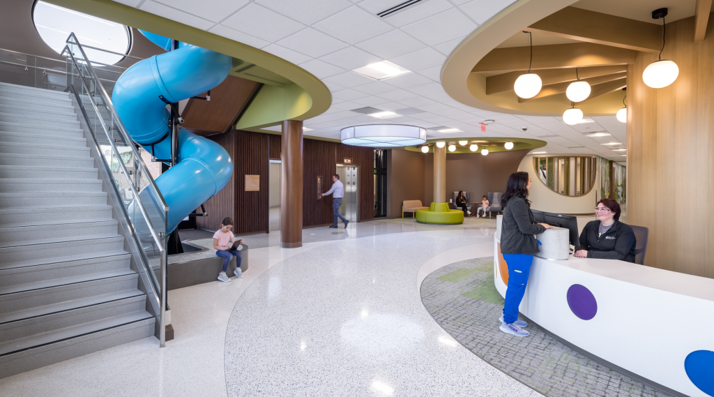
A desire to bring together kid-centric fun and access to nature resulted in a treehouse theme that creates a sense of joy and warmth throughout the facility.

“We wanted to prioritize safe outdoor play space for every unit. So, you can go directly from your inpatient unit to the outside,” Melanie says. “In the front of the building, there’s pocket parks. There’s a place for staff to be outside. If you’re bringing a kid to urgent care, you can wait outside in the pocket park. If you’re going to outpatient services, you can play in the pocket park to get the wiggles out.”

And while access to the outdoors is critical, the team also wanted to bring the fun inside. For outpatient services, located on the second floor, a slide provides a playful alternative to the stairs or elevator when it’s time to leave.

“Even if they’re there for a long day of partial hospitalization or psych testing, they can choose that fun exit. And it doesn’t all have to be heavy,” she shares. “Sometimes mental and behavioral health visits can feel really heavy. But they’re still kids. We still want them to have that joy, and the slide is one way that we took the treehouse theme and put that whimsy into the building.”

Budgeting for Big Impact

Budget realities are a challenge across markets, but behavioral and mental health facilities tend to face additional funding restraints. “This project was no exception,” Melanie says. “When we compare our cost per square foot for our new building to other projects that we know were happening across the country at the same time, in some cases, we had half the cost per square foot in order to develop this building.”

Melanie shares that close collaboration with EV Construction, the construction partner on the project, helped the team achieve success within this tight budget. “They were on early helping us think of ideas, evaluate options, and really look at ways that we can prioritize the needs of kids and family and what things could we compromise on.”

Together with the Pine Rest team, who had clear priorities and goals for the Center, BWBR worked to bring forth their vision with care.

Designing with Purpose

Projects that have such a meaningful impact on children, their families, and entire communities leave a lasting mark on the teams that work on them, too.

“I’ve been doing this a long time, and every project I’ve ever touched in my career feels like mine,” Melanie says. “And it’s not mine as an individual—it’s mine, and it’s yours, and it’s all of our team members who touch it. It is our project collectively.”

That rings true for the Pediatric Center for Behavioral Health, a project designed to bring shorter wait times for services while incorporating whimsy in the environment, helping families feel cared for, and giving staff the support they need.

“Through that ownership, we bring a sense of care and support to the mission of our clients, which is critical in the success of this project and all of our projects,” she shares. “Bringing that personal care from every member of our team into our work is what we owe our clients who are giving us the opportunity to understand their needs and help them move forward into their future.”

Together with that shared commitment from our team, partners, and client, the Center is more than a new facility—it’s a reflection of how design can break down barriers to care, strengthen communities, and bring a refreshed sense of hope and joy to behavioral and mental health services.

Trend Report: 2026 Design Days & NeoCon

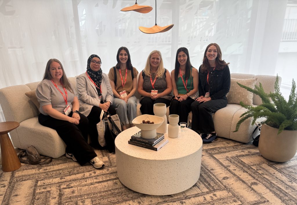
Every year, NeoCon and Design Days provide a snapshot of where the design industry is headed. New products, new materials, new colors, and new ideas all compete for attention across the events’ hundreds of showrooms and installations.

This year, however, the biggest takeaway wasn’t a particular furniture collection, finish, or technology. It was something much larger: people are craving emotionally rich spaces. Recently, commercial interiors have celebrated restraint, with minimal, quiet, and highly optimized spaces often gaining the most admiration. While undeniably beautiful, many environments prioritized efficiency over emotion.

Walking through the showrooms this year felt different. Products and materials weren’t trying to blend into the background, they were trying to make people feel something. Here’s a look at the standout ways we saw this in action:

Color is Back—and It’s Here to Stay

Perhaps the most noticeable shift throughout NeoCon and Design Days was the return of color—not as a single accent chair in an otherwise neutral room, but as a defining design strategy. Across showrooms, designers embraced saturated hues and unexpected combinations throughout furniture, textiles, architectural elements, lighting, and accessories.

Several color families appeared repeatedly:

  • Oxblood and berry tones
  • Periwinkle and blue-violet hues
  • Blues ranging from sky and cornflower to cobalt and navy
  • Deep evergreen and juniper greens
  • Vibrant oranges and persimmon tones
  • Rich espresso and cocoa browns
  • Chrome and reflective metallic finishes

What made these palettes particularly interesting wasn’t just the colors themselves—it was the bold ways they were being paired together: periwinkle with orange, oxblood with evergreen, cobalt with orange, and espresso with chrome. Designers seemed less interested in playing it safe and more interested in creating memorable experiences through bold combinations.

The Rise of Color Drenching

One of the strongest trends was the continued evolution of color drenching.

Rather than introducing color as a small accent, many showrooms committed fully to a palette and carried it throughout furniture, finishes, textiles, and accessories. This created spaces that felt immersive, cohesive, and emotionally impactful.

The result was a greater sense of identity and character—something many workplaces, healthcare environments, and educational facilities are increasingly seeking as they compete for attention, engagement, and connection.

Layered Maximalism Emerges

Minimalism and maximalism are coming together to create a new evolution in how space is utilized. Many of the most compelling showrooms embraced what could best be described as layered maximalism—a more refined version of maximalist design that prioritizes richness over clutter.

These environments combined:

  • Multiple textures
  • Decorative lighting
  • Greenery
  • Drapery
  • Sculptural furniture
  • Rich materials
  • Layered accessories

While minimalism can feel empty and maximalism can feel overwhelming, these environments combined the best of both philosophies, resulting in curated and expressive spaces.

Taking Inspiration from the Past

Mid-century modern influences like organic curves and natural elements merged with manufactured materials were still on the rise, particularly in furniture detailing and silhouettes. However, these references felt less nostalgic and more contemporary, often combined with hospitality-inspired materials and richer color palettes.

Curves continue to dominate over straight and sleek lines, with rounded seating, circular tables, radiused corners, and softened architectural details appearing throughout countless product introductions.

After years of matte black as the popular choice for finishes, reflective metals made a noticeable return. Chrome, bright nickel, and polished metallic finishes appeared throughout furniture, lighting, and architectural details. These materials introduced energy, light, and visual contrast while reinforcing the broader shift toward more expressive environments.

Hospitality Shaping Commercial Design

A theme that appeared throughout the week was the continued influence of hospitality and residential design. Workplaces, learning environments, and healthcare settings increasingly borrowed from the warmth, comfort, and character traditionally associated with hotels, lounges, and homes.

Bold designs with rich identities and curated details are helping to create a distinctive sense of place in commercial environments. A renewed emphasis on comfort in furniture and textiles is enhancing social connection and wellbeing, creating places where people want to gather and collaborate. Spaces also emphasized flexibility, encouraging users to shape their environments to work for their needs.

Rather than focusing primarily on function and efficiency, designers are creating destinations that feel inviting and meaningful—places where people genuinely want to spend time and connect.

The Bigger Story

Interestingly, this movement mirrors what has already happened in fashion. After years of quiet luxury, beige capsule wardrobes, and understated palettes, fashion embraced rich colors, bold patterns, maximal accessories, and more expressive styling. Now, interiors appear to be following a similar path.

The shift isn’t really about burgundy upholstery or chrome finishes, it’s about emotion. It’s about creating spaces that foster comfort, connection, delight, and memorable experiences. The biggest trend of NeoCon and Design Days 2026 wasn’t a color, material, or furniture collection. It was a renewed focus on how spaces make people feel.

The result is a new generation of environments that are warmer, richer, more expressive, and unapologetically human. And perhaps that’s the most important trend of all. The future of design isn’t less personality. It’s more.